
Blog 1: A Tutorial on EDA
The way I was taught to conduct exploratory data analyses
Exploratory Data Analysis
An exploratory data analysis, or EDA, is a method of reviewing the data you have to check you can answer the questions you have. You can do this with graphs, plots, summary statistics, a combination of those, or other methods. I will review how I do EDAs with an R Markdown report. This tutorial assumes you have access to R Studio, a clean dataset that requires no changing of data types or imputing of missing values, and can code in R, to create an EDA report.
It helps to have a report template set-up to conduct an EDA. The main sections of such an R Markdown report are the YAML heading, the R code setup chunk, the introductory “Purpose of Analysis” section, the main features and patterns section, the model proposal section, and the next steps section. I will review each of these in turn.
YAML Heading
Opening an R Markdown file in R Studio reveals a YAML header, an R code chunk titled r setup, wrapped in triple backticks (```) at each end, and also examples of Markdown headings, text, and R code chunks. To create EDA reports to hand to other statisticians in my college program, I usually delete everything below the r setup code chunk and begin editing the YAML heading.
What is a YAML heading? According to redhat.com,
YAML is a data serialization language that is often used for writing configuration files. Depending on whom you ask, YAML stands for yet another markup language or YAML ain’t markup language (a recursive acronym), which emphasizes that YAML is for data, not documents.
Here’s an example of a YAML heading:
---
title: "Exploratory Data Analysis of Iris Data Set"
author: "Jillian Warburton"
date: "2023-02-08"
output: pdf_document
---
The title, author, and date sections are fairly self-explanatory, just wrap whatever words you want printed on the report in double quotation marks. Change those sections to fit your report title, your name, and the date you hand in the report. The output section of a YAML heading can be changed to produce, or knit, any type of document R Studio can produce. We used pdfs for EDA reports in college, and unless someone really wants another file type, I would stick with a pdf. When you are finished creating the report, you can knit the report into a pdf.
R Code Setup Chunk
The first R code chunk in an R Markdown report is generated as:
{r setup, include=FALSE}
knitr::opts_chunk$set(echo = TRUE)
I have found it helpful for my EDAs to edit this chunk’s first code line to instead say: knitr::opts_chunk$set(echo = TRUE, include = TRUE) to have all code chunks run and be shown in my EDAs, so that my peers and professors can follow my code. If I were to give this to a coworker or associate without a statistical background, I would probably edit the line to instead say knitr::opts_chunk$set(echo = FALSE) so as to hide the R code chunks’ code and output from the final report, but still evaluate the code inside of the chunk for reference.
I next began loading my libraries in this code chunk. I always find myself using:
tidyverseto use pipes and data frames easier and to create more polished graphicsDataExplorerto check for missing values and create a professional correlation plotgridExtrato combine related graphs on the same row of a page, instead of having page-wide graphs taking up an entire pageRColorBrewerorpaletteerto make sure my graphs use a color-blind-safe theme
Other libraries I have used in EDAs include vroom, GGally, and kableExtra, for which you can find documentation at https://www.rdocumentation.org/.
After loading my libraries, it’s time to load the data. I will not be reviewing how to clean or structure a data set in this tutorial, but a good source I found is at https://www.geeksforgeeks.org/data-cleaning-in-r/.
Purpose of Analysis
The first purpose to determine in an EDA is what questions you wish to answer with a given dataset. Are you trying to understand why the dependent variables lead to the independent variable? Do you want to determine which variables are needed to best predict the independent varaible? Are you looking for interactions between variables? Look at what questions you can reasonably answer with your data, and list them in this section.
The second purpose to determine is why anyone should care about answering those questions. If I was reporting an EDA on the iris dataset (which can be found in R Studio as iris), I could explain that I wanted to determine the species of an iris by its measurements for the purpose of practicing classification. If I had a data set from a medical treatement experiment, I could be trying to determine if the experiment can reject the null hypothesis that the medical treatment does not affect patients. There’s always a reason to conduct an EDA, the trick is to explain why the one you are reporting on is interesting and/or important.
Main Features and Patterns
Now that we know which questions we have, it’s time to create exploratory plots and calculate summary statistics from the data. Tables of summary statistics can be good, but graphs are generally easier to read and understand. In our report, we’ll comment on any potential relationships we see from these exploratory visuals.
Graphs and Plots
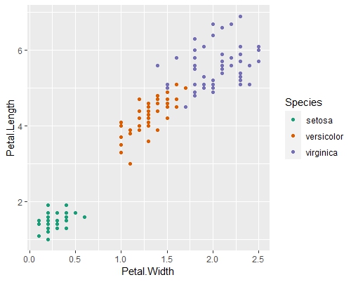
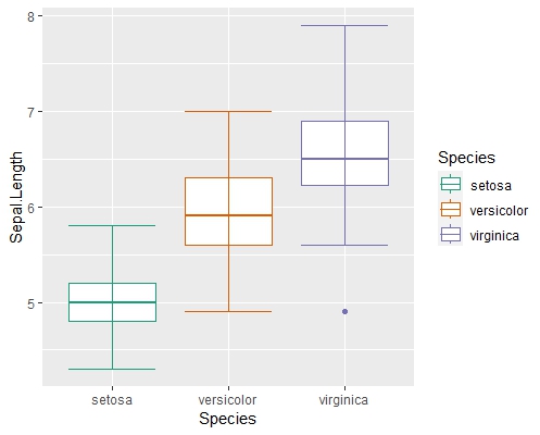
Here is where the main bulk of your report will likely end up. It is good practice to show as many vizualizations of the data as needed for a full picture of the variables and their features. I like to create scatterplots for discrete or continuous variables and boxplots to visualize the summary statistics or to view categorical variables. Below are two examples of R code chunks and the plots they create.
ggplot(data=iris, mapping=aes(x=Petal.Width, y=Petal.Length, color = Species))+
    geom_point() +
    scale_color_brewer(palette = 'Dark2') #for color-blind-safe theme
ggplot(data = iris, mapping = aes(x = Species, y = Sepal.Length, color = Species)) +
    geom_boxplot() +
    stat_boxplot(geom = 'errorbar') + # to see end of quartiles
    scale_color_brewer(palette = 'Dark2') # for color-blind-safe theme
Correlation Between Variables
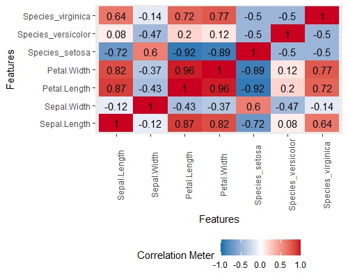
I like to use the DataExplorer library for the plot_intro and plot_correlation options. There are other options that can help with an EDA, but those are my two favorites (I’m also fond of plot_missing in data cleaning, but that’s a post for another time). Below is my plot_correlation graph for the iris data set. It shows the strength of correlation between variables in a matrix-like plot. This is useful for showing possible interactions or variable selection.
Model Proposal
Now that we have reviewed our EDA purpose and looked at our data sets, it’s time to propose a tentative model for the relationship between the data’s variables. Due to my coursework focusing on linear regression, I usually suggest a multiple linear regression model, but check what type of data you have for your dependent variable. For the iris data set, for example, I’d probably be focusing on a classification model, unless I was trying to use the species and petal measurements to predict the sepal measurements.
Next Steps for Analysis
This could probably be renamed as the “Conclusion” of the report, but being a college student, we always titled this last section of our EDA reports “Next Steps”. Here is where we can state which questions we can answer or not, additional questions that may be worth asking about the data, parts of the future analysis we would need to learn, or rarely, additional data needed to answer the requested questions.
Conclusion
Exploratory Data Analyses are a necessary first step to reviewing data sets before conducting statistical inference or prediction. Reports can be made easily and professionally in R Markdown before downloading into a pdf. There are many libraries that can help with the content of an EDA report, but remember to state the questions and purpose, show visuals of the data where possible, and state what is needed to achieve the purpose of your EDA report.