
Blog 3c: The "World Factbook" and Me
What I concluded about moving abroad from the "World Factbook"
Last Time….
I collected my data from the The World Factbook, a public-facing resource for country data published by the CIA. I webscraped 7 pages with the Python package BeautifulSoup, namely:
- Maternal mortality ratio: the annual number of female deaths per 100,000 live births
- Infant mortality rate: the annual number of the deaths of infants under one year old per 1,000 live births
- Education expenditures: the percentage of GDP spent on education
- Unemployment rate: the percent of the labor force that is unemployed. This comparison is ranked from lowest to highest
- Gini Index coefficient – distribution of family income
- Internet users: the number of users within a country that access the Internet. The CIA notes that counting internet users in a country is not standardized, so could include people who access the internet anywhere from weekly to biannually
- Broadband - fixed subscriptions: the number of subscriptions for physically wired connection to the Internet
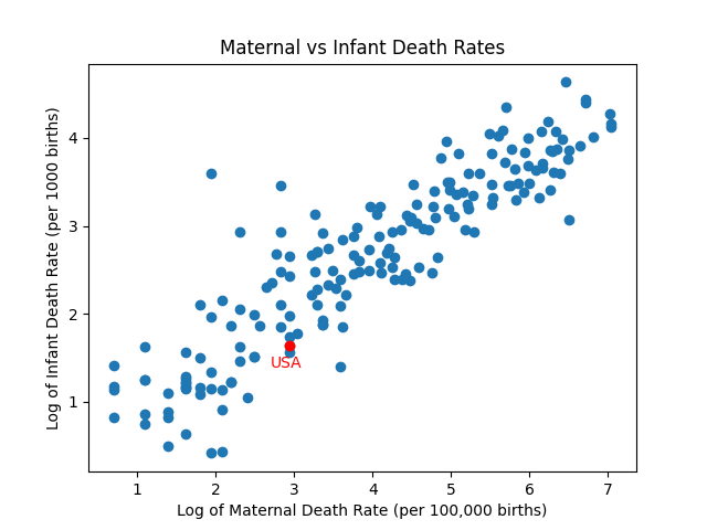
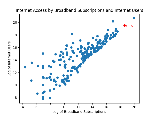
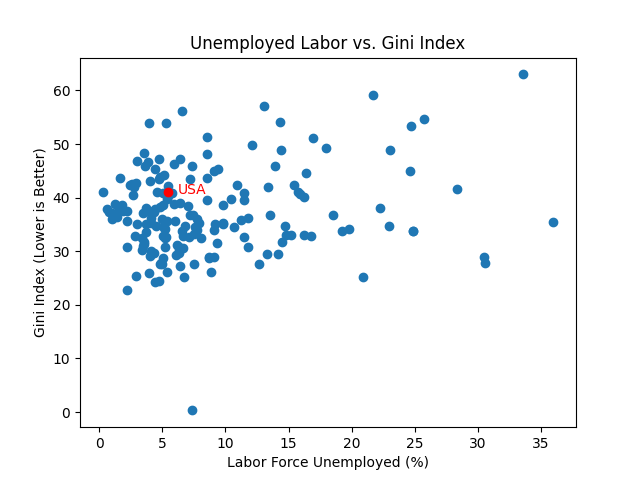
I showed some exploratory graphs of how my collected data looked, when comparing maternal and infant mortality rates at birth, internet and broadband users, and unemployment (as a percentage) and Gini Index. Those images showed a correlation between maternal and infant mortality rates at birth, as well a correlation between internet and broadband users, but NOT between unemployment and Gini Index.
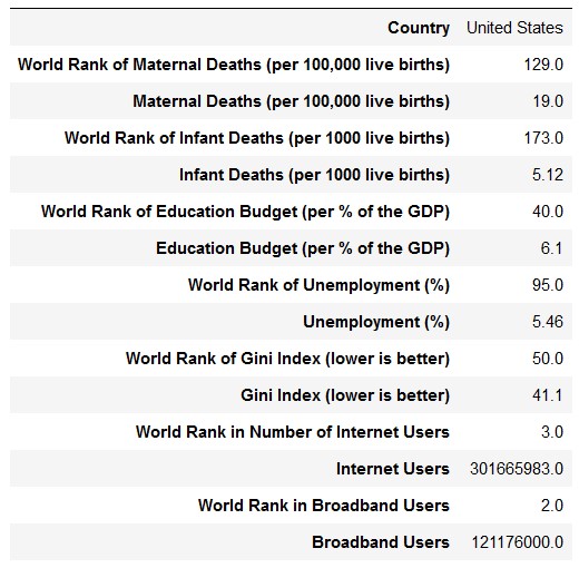
Where is the United States?
Below is a listing of where the United States falls in every ranking, and what number earned that ranking. I wanted to compare countries to the United States, so I needed to have this information easily available:
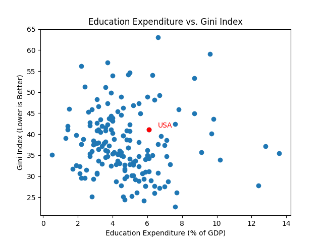
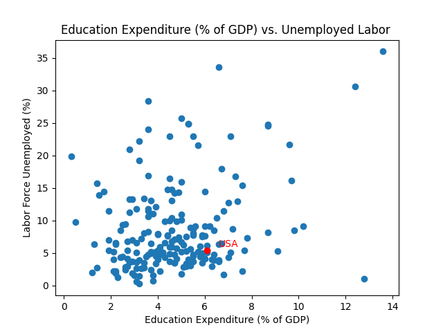
A Visual Look
Below are 5 graphs that annotate where the United States is in relation to the rest of the world. The graphs below are titled and labeled to show what is being compared. Judging by these graphs, I should be able to find countries that are better than the United States in some categories, except for internet and broadband users. I noticed, however, that virtually all countries with large numbers of those users also have large populations. I will need to think of a better way of comparing internet accessibility between countries in the future.
Conclusion
In this post, I showed how the United States compared to other countries in terms of internet and broadband users, maternal and infant mortality rates, unemployment and Gini Index, and education expenditure (as a percentage of GDP).
The complete code and data can be found in my GitHub repo.
Please comment below if you have any suggestions or questions for me. I would love to know what you thought about my graphics!